Sunday, October 26, 2014

Neville Brody Lecture & FUSE Designers

Gerard UngerBorn at Arnhem, Netherlands, 1942. Studied graphic design, typography and type design from 1963–’67 at the Gerrit Rietveld Academy, Amsterdam. He teaches as visiting professor at the University of Reading, UK. Department of Typography & Graphic Communication, and taught at the Gerrit Rietveld Academy till January 2007. From 2006 till 2012 he was Professor of Typography at Leiden University, the Netherlands. Free lance designer from 1972. He has designed stamps, coins, magazines, newspapers, books, logo’s, corporate identities, annual reports and other objects, and many typefaces.
http://www.gerardunger.com/biography/biography.html

Barry Deck"After graduation from Northern Illinois University in 1986, he was recruited as a junior designer for Lipmon & Simmons in Chicago, and then as a graphic designer for Kim Abrams Design. He returned to academia in 1987, enrolling on a Masters of Fine Arts programme at the California Institute of Arts where he studied an experimental approach with Ed Fella and Lorraine Wild. He moved to New York in 1992, and was seen as quite a radical for the somewhat conservative typeface community.Deck has become associated with distorted typefaces, which began to appear in publications such as Ray Gun, Emigré, Wired Eye, and I.D. in the early 1990s. His typefaces came to typify the 'new wave' of the early 1990s and Emigré proclaimed his font Template Gothic as "the typeface of the decade".In 1995 he set up his own company, Dysmedia, and has worked with Pepsi, Reebok, Nickelodeon, and VH1.In Deck's own words: '…he continues his effort to help fill the world with interesting, intelligent, idiosyncratic, ironic, beautiful and amusing stuff. And he has no lawn.'"http://www.identifont.com/show?1HV


Paul Elimann
"Paul Elliman (1961) is a London-based designer whose work and writing explores the mutual interests of technology and language. His work has been exhibited at the Tate Modern in London and included in collections by the British Council, London's Victoria and Albert Museum and the Cooper-Hewitt National Design Museum in New York. He is a visiting critic at Yale University School of Art, New Haven, and is thesis supervisor at the Werkplaats Typographie in Arnhem, Netherlands. Paul Elliman has contributed essays to several magazines and journals including IDEA, Eye, and Dot Dot Dot."
http://www.peterbilak.com/graphic_design_in_the_white_cube/elliman.html

Rick Vermeulen"Rick Vermeulen was born in Schiedam, the Netherlands in 1950. He studied graphic design at the Rotterdam Academy, graduating in 1972. From 1975, he worked regularly for the publisher Bert Bakker and was a participant in Rotterdam’s Graphic Workshop, where designers and artists produced material for cultural organisations in the city and events such as the Rotterdam Film Festival. From 1978-82, Vermeulen was an editor of Hard Werken magazine, along with Willem Kars, Henk Elenga, Gerard Hadders and Tom van den Haspel. The cultural tabloid made a considerable national impact and the group became a design studio operating under the name Hard Werken, with each designer supervising his own projects. By the end of the 1980s, in a changing business and cultural climate, Hard Werken was in financial trouble. In 1994, the company moved from Rotterdam to the Amsterdam area and amalgamated with the packaging design company Ten Cate Bergmans, subsequently changing its name to Inizio. In 1993, Vermeulen, a regular visitor to the United States, with teaching experience at Cranbrook, CalArts and North Carolina State University, moved to Los Angeles, where he took over the position formerly occupied by Henk Elenga as Hard Werken LA Desk. After two years in the city he decided to return to the Netherlands. In 1995, the retrospective exhibition ‘From Hard Werken to Inizio’ was staged at the Karmeliterkloster, Frankfurt am Main and the Kunsthal, Rotterdam, marking the end of an era for Vermeulen and the original founders. In recent years, Vermeulen has designed two typefaces for Fuse. He collaborates with Inizio and works on freelance projects for publishing and other clients."http://www.eyemagazine.com/feature/article/reputations-rick-vermeulen

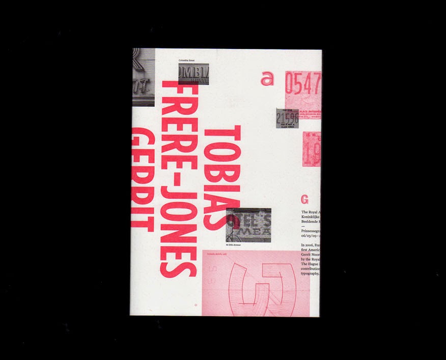
Tobias Frere-Jones"Over 25 years, Tobias has established himself as one of the world’s leading typeface designers and created some of the world’s most widely used typefaces. He received a BFA in Graphic Design from the Rhode Island School of Design in 1992. He joined the faculty of the Yale University School of Art in 1996 and has lectured throughout the United States, Europe and Australia. His work is in the permanent collections of the Victoria & Albert Museum in London and the Museum of Modern Art in New York. In 2006, The Royal Academy of Visual Arts in The Hague (KABK) awarded him the Gerrit Noordzij Prijs, for his contributions to typographic design, writing and education. In 2013 he received the AIGA Medal, in recognition of exceptional achievements in the field of design."http://www.frerejones.com/about/

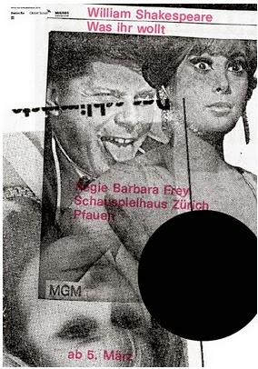
Cornel WindlinAfter graduating from college, Windlin "moved to London in 1988 to work for Neville Brody and later became art editor for THE FACE magazine. In 1993 he returned to his native Switzerland and started his own design practice in Zurich. Cornel Windlin’s design work quickly won critical acclaim and has since been exhibited in museums and published in design books and all leading design publications. He has lectured in the US, England, Germany, Austria, Israel and Switzerland. He currently works as a designer/art director in both Zurich and London for a number of clients in both cultural and commercial fields. Cornel Windlin started creating typefaces primarily for use in his own work while still at art school. Together with Stephan Müller, he formed the digital font foundry LINETO to distribute his fonts and those of an illustruous circle of friends. Lineto.com has evolved into a network of designers between Switzerland, New York, London, Tokyo, Stockholm, Vienna and Berlin, creating a platform for shared attitudes and common interests. Windlin has created corporate typefaces for clients as diverse as Mitsubishi cars or the Herzefeld Memorial Trust, or custom fonts for projects at Kunsthaus Zurich, Tate museums as well as various editorial projects."https://www.fontfont.com/designers/cornel-windlin


Wednesday, October 22, 2014

Type 1: Questions

-- What are small capitals? How are they different than something set in ALL CAPS?
"Small caps are uppercase letterforms that are shorter in height than the capitals in a given typeface. When designed as part of a text face, they are most often the height of the lowercase (or very slightly taller), so that they harmonize with both the caps and the lowercase characters. Small caps that are designed for display typefaces have more flexibility in their proportions, and are often taller than the x-height." It makes a line of uppercase letters less jarring. Setting in all caps is larger. 

-- Does your font have small caps? If not name a font that does.

My font, Bembo, can be put into small caps, but Georgia Pro has been designed with small caps. 

-- Ligatures? why are they used? when are they not used? what are common ligatures?

"ligature occurs where two or more graphemes or letters are joined as a single glyph." They are used when two characters share common elements or overlap and can be combined. They are not used between characters all the time. Common ligatures are "fi" and the ampersand "&" a combinated evolved of "e" and "t". 

-- Does your font have ligatures? If not name a font that does.

Bembo does have ligatures.

-- Difference between a foot mark and an apostrophe? Difference between an inch mark and a quote mark (smart quote)?

Feet and inch marks are for describing feet and inches, " ', apostrophes are for possessives, plurals and quotations.

-- Hyphen, en dash and em dashes, what are the differences and when are they used.
A  hyphen "Indicates breaks within words that wrap at the end of a line. Connects compounded words like “mass-produced”. (Closed compound words like counterintuitive have no hyphen in modern English, except for uncommon combinations that are confusing or ambiguous without a hyphen. Connects grouped numbers, like a phone number 555-860-5086 (but not used for a range of numbers, like a date range)."
An en dash "Joins numbers in a range, such as “1993–99” or “1200–1400 B.C.” or “pages 32–37” or open-ended ranges, like “1934–”. Joins words that describe a range, like “July–October 2010”"
Em dash is for "Works better than commas to set-apart a unique idea from the main clause of a sentence. Separates an inserted thought or clause from the main clause... Shows when dialogue has been interrupted”".


http://www.fonts.com/content/learning/fontology/level-1/type-anatomy/small-caps
http://en.wikipedia.org/wiki/Typographic_ligature
http://www.punctuationmatters.com/the-hyphen-dash-n-dash-and-m-dash/

Saturday, October 11, 2014

Font Information & Bembo

Bembo is a serif, old style font commissioned by Aldus Manutius, cut by Francesco Griffo in 1495 and redesigned as we see it today by Stanley Morrison in 1929. It has an extensive family with bold, bold italic, extra bold, extra bold italic, italic, regular, semibold, semibold italic options.

Old face types usually have lightly bracketed serifs, with a moderate change from thick to thin strokes in the letter and an oblique stress in the direction of the thick strokes. The italic form is usually slightly decorative. The letters tend to be light in weight, although the type family usually includes a bold version. Example: Bembo

Transitional types have serifs that are more clearly bracketed and have a more marked, but not abrupt, change from thick to thin strokes. There is a less obviously oblique direction in the heavy part of the letter. Example: Baskerville

Modern types have fine, unbracketed (hairline) serifs with a strong contrast between thick and thin strokes. There is a strong vertical stress in the direction of the heavy parts of the letters. Example: Didot

Stroke Weight: The thickness of lines in a font character.

Axis: An imaginary line drawn from top to bottom of a glyph bisecting the upper and lower strokes is the axis

Small Caps: are uppercase (capitalcharacters set at the same height and weight as surrounding lowercase (small) letters or text figures.


Lining figures: an arabic numeral that aligns with the base of a type line or printed line —called also modern figure.


Non-Aligning Figures: Text figures (also known as non-lining, lowercase, old style, ranging, hanging, medieval, billing, or antique figures or numerals) are numerals typeset with varying heights in a fashion that resembles a typical line of running text, hence the name.

Ligature: Two or more letters combined into one character make a ligature. 

"When type was cast in metal, the printing surface – the “face” – was mounted on a block of metal called the “body”. The type sizes – measured in points – refered to this metal body rather than the face itself. The proportion of the face on the body could vary considerably from one typeface to another. This principle still applied. For example a 10 point type is one that measures 10 points from baseline to baseline when set solid (ie without any extra space being added between the lines). So it is possible for one 10 point type to look smaller than another but they will both take up the same depth from line to line. Most typefaces that look big on the body have a large x-height and short ascenders and descenders."

http://www.linotype.com
http://www.typographydeconstructed.com

Saturday, October 4, 2014

Type

As we continue creating type I seem to see it everywhere. Today I happened upon my roommate's rubber band in a nice shape of "D" (excuse the quality it was taken as I was running out the door), and my gif for the alphabet I finished for the second project of typography.

Friday, October 3, 2014

Erik Marinovich Workshop

Todau I attended the workshop with hand-letter Erik Marinovich. It was a really cool experience to get to learn from him and see how a professional works. We worked with ampersands, initially making many sketches rapidly and then refining them on the computer. It was a a great experience.