For several years now, my Pinterest account has held a sizable amount of my design inspiration. For this good design project I have been scouring the “Illustrations & Posters” sections as well as my personal design board for inspiration. I’ll probbaly have a panic attack if the website is ever shut down because of the sheer amount of time and data I have put onto my account. What can I say? Some would say this is wasted time but I think its a great resource. Pinterest gets you onto other design blogs and boards, and is kind of just a venue for people to put up all of the amazing work that they do. Pinterest is a great way to get inspiration and find new sources.
Monday, September 23, 2013
Sunday, September 22, 2013
Friday, September 20, 2013
Color Theory
From the color theory presentation, I learned a lot of theories and strategies of using color to create unity. Hue is the family name of a color, such as green, red, or blue and it carries expressive aspect. Value is lightness or darkness of a clolor. Tints are colors at the top. Shades (mixed with white) are colors at the bottom (mixed with black,grey or opposite color on wheel) and shde also create 3 dimensional form. Achromatic is black and white, which represents truth or honesty. Chroma is the purity of the color, ranging from strong chroma- straight out of the tube- to weak chroma that looks very greyed out.
We also learned ways to use all of this to make a good palette. For example, color balance states that we intuitively we react better to the darker value being dominant. Color unity states that artists and designers employ color unity strategies to convey an idea more clearlyand helps define what to look at. A limited palette could also create unity. One of the best ways to create unity is by using hue, value or chroma dominance (different shades of one color). Transitions in hue, value or chroma create color unity by eliminating big visual leaps, showing the viewers eye path through the picture plane. All of these strategies help designers keep their color use clean and valuable.
Monday, September 16, 2013
Sugar Paper
I got am email about Sugar Paper, a design company from Los Angeles that specializes in letterpress. I looked into their work and even though I don't want to go into a design firm like this, I thought it was really cool. I think the letterpress factor is also cool
and really unique.
and really unique.
Monday, September 9, 2013
Notegraphy
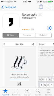
I found this app the other day that lets you create a little page with a quote and their layouts. There are a million of these on Pinterest, online in general, and I thought it was interesting that there is an app for it now. I thought it was cool that they have such an emphasis on the designer and design. Plus I think the layouts all look really great. I think the icon, with the simple black apostrophe on white is beautifully simple. 

Friday, September 6, 2013
DESiGnsperation
For several years now, my Pinterest account has held a sizable amount of my design inspiration. For this good design project I have been scouring the "Illustrations & Posters" sections as well as my person design boards. Here is the link to my page and some of my favorites from the past couple days- pinterest.com/devonm72
Monday, September 2, 2013
What is good design? Color theory
For this project I created a few color schemes by putting
objects together, but mainly I took photos of found places and situations
already existing. I learned that the color unity strategies can be easily made
with the other harmonious and contrasting hues, values and chroma. I played
with color, moving around different patterns and shades to see what they looked
like through the lens. Overall I enjoyed this project. I got to play with color
and experiment with something I had never done before.
Subscribe to:
Comments (Atom)


